Pingdom Finance
Pingdom Finance Dashboard UI
Services
Dashboard & Analytics Interfaces
Services
Dashboard & Analytics Interfaces
Services
Dashboard & Analytics Interfaces
Tools
Figma
Tools
Figma
Tools
Figma
Value
Empowering users to take control of their finances through a clean, intuitive interface that transforms complex data into actionable insights, So they can track, manage, and grow their money with confidence
Value
Empowering users to take control of their finances through a clean, intuitive interface that transforms complex data into actionable insights, So they can track, manage, and grow their money with confidence
Value
Empowering users to take control of their finances through a clean, intuitive interface that transforms complex data into actionable insights, So they can track, manage, and grow their money with confidence
Timeline
7 Days
Timeline
7 Days
Timeline
7 Days
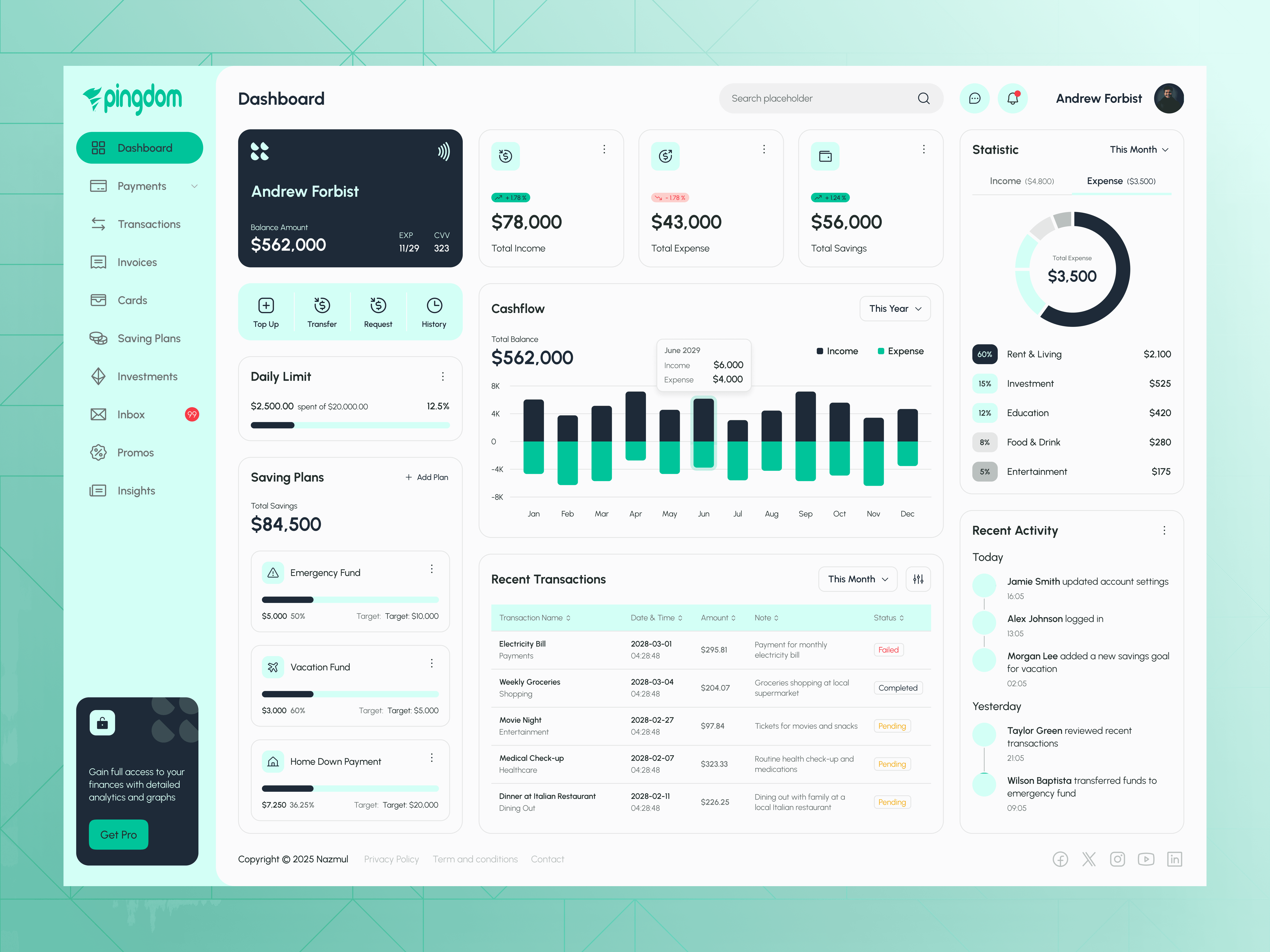
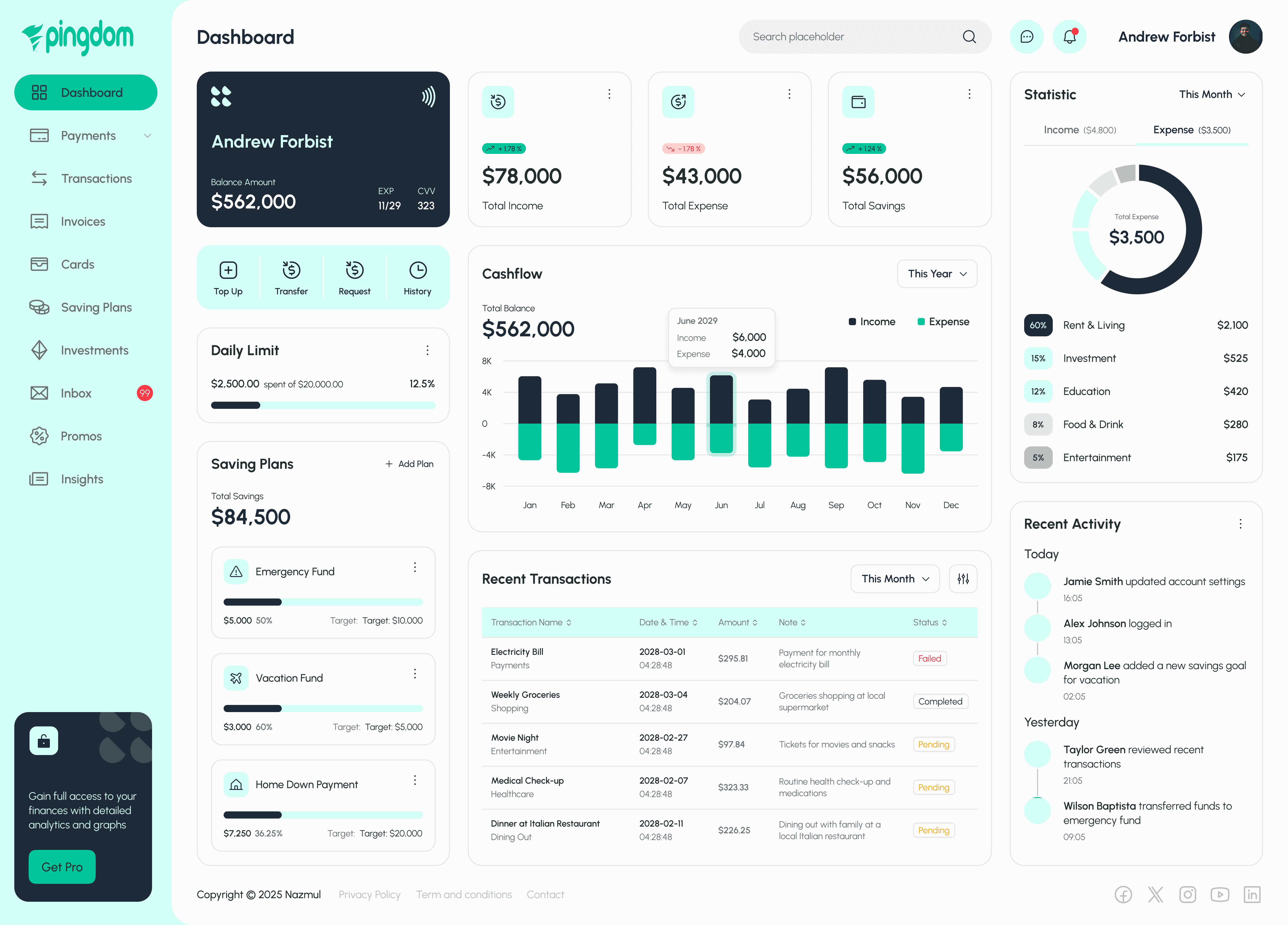
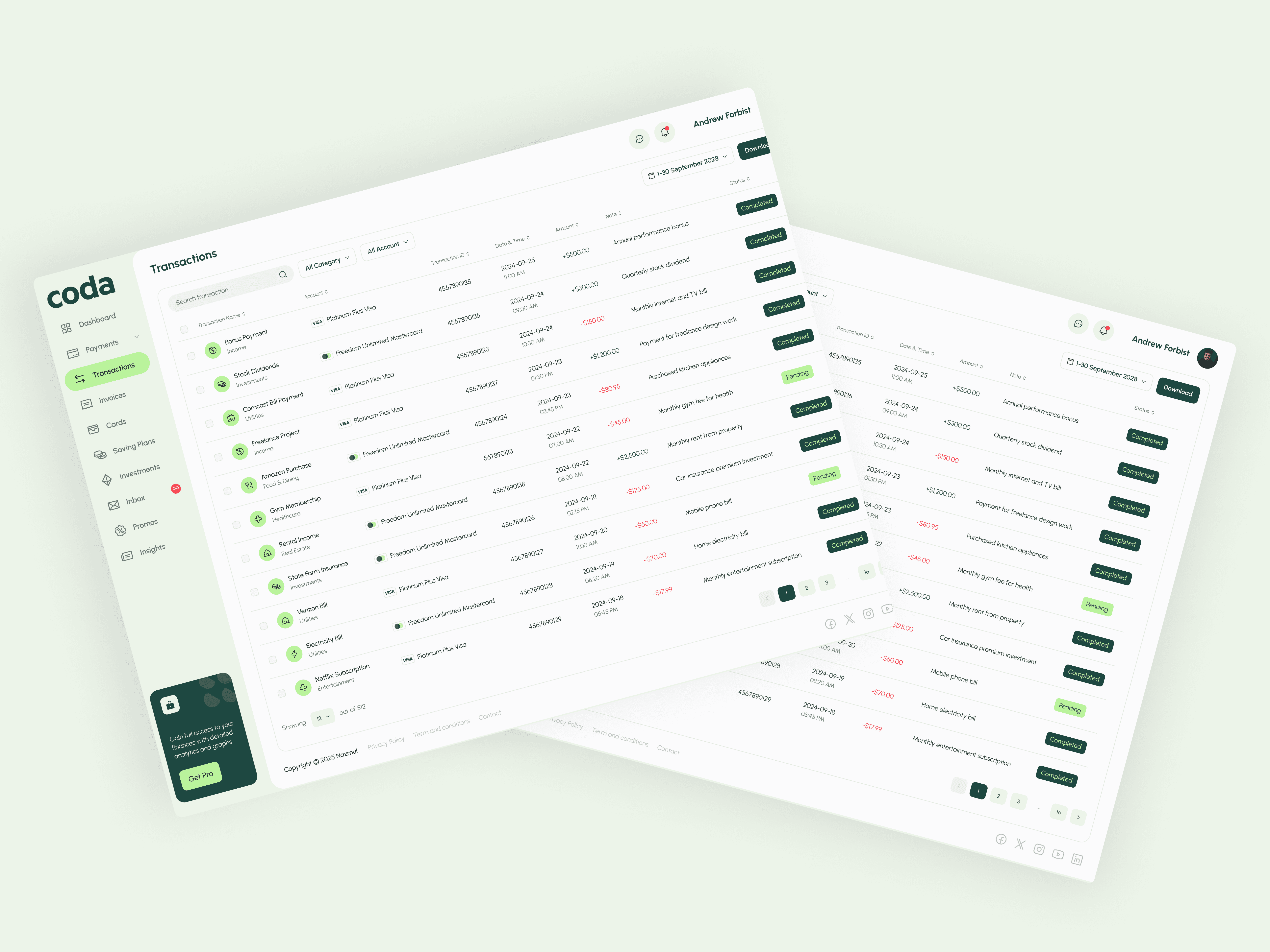
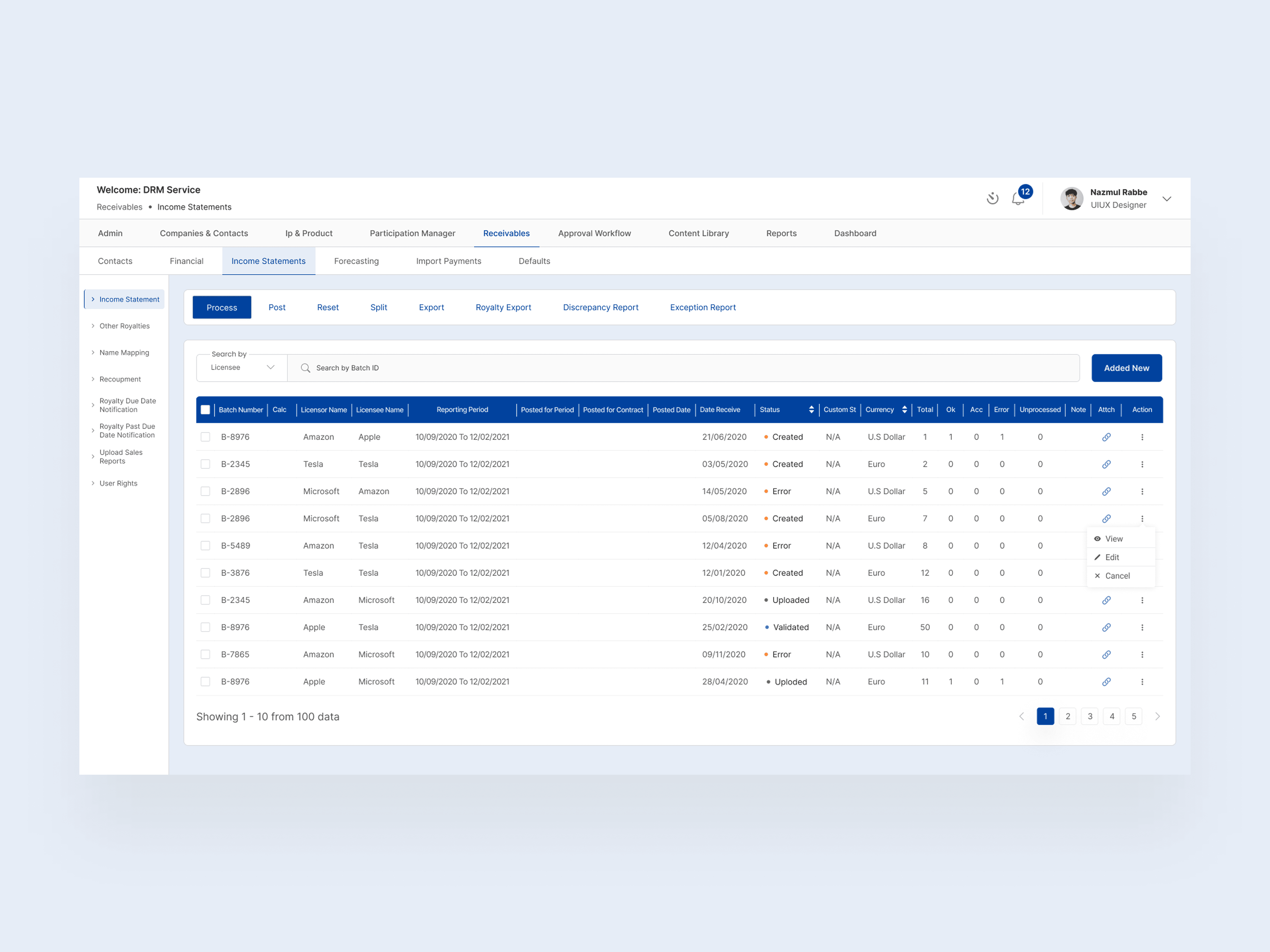
Presenting Pingdom Finance Dashboard, a sleek and modern UI concept for a personal finance app. Designed in Figma, this dashboard showcases a clean layout with intuitive data visualizations—total balance, cash flow charts, savings plans, and expense breakdowns, all at a glance. The soft mint-and-dark-blue colour palette keeps the interface fresh, while bold typography highlights key figures. Swipe through to explore interactive cards (Top Up, Transfer, Request, History), monthly income vs. expense bar charts, and a detailed “Recent Transactions” table. Let me know what you think! ✨🔍
Presenting Pingdom Finance Dashboard, a sleek and modern UI concept for a personal finance app. Designed in Figma, this dashboard showcases a clean layout with intuitive data visualizations—total balance, cash flow charts, savings plans, and expense breakdowns, all at a glance. The soft mint-and-dark-blue colour palette keeps the interface fresh, while bold typography highlights key figures. Swipe through to explore interactive cards (Top Up, Transfer, Request, History), monthly income vs. expense bar charts, and a detailed “Recent Transactions” table. Let me know what you think! ✨🔍
Presenting Pingdom Finance Dashboard, a sleek and modern UI concept for a personal finance app. Designed in Figma, this dashboard showcases a clean layout with intuitive data visualizations—total balance, cash flow charts, savings plans, and expense breakdowns, all at a glance. The soft mint-and-dark-blue colour palette keeps the interface fresh, while bold typography highlights key figures. Swipe through to explore interactive cards (Top Up, Transfer, Request, History), monthly income vs. expense bar charts, and a detailed “Recent Transactions” table. Let me know what you think! ✨🔍
Key Learnings & Next Steps
Learnings:
Data Hierarchy Matters: Users preferred the prominent balance card at the top and felt “saved” by seeing high-contrast numbers first.
Visualizing Negative vs. Positive: Placing expense bars below zero and income above made trends more intuitive.
Progress-Based Motivation: Clear percentage bars for savings goals encouraged participants to think about incremental targets rather than an overwhelming lump sum.
Let’s connect!
Let's work together. Feel free to reach out and
Contact me at: nazmulrabbe14@gmail.com to tell me about your project.
If you like any of my work, please follow me on Dribbble.
Facebook || Instagram || Linkedin || Behance
#DashboardDesign
#UIDesign #UXDesign #UIUXDesign #UserInterface #UserExperience #DashboardUI #AppDesign #DesignInspiration #DailyUI
#PersonalFinance #FintechDesign #FinanceDashboard #FinancialPlanning #MoneyManagement #BudgetingApp #FinanceApp
#WealthManagement #FinancialGoals #SavingsTracker

Reach out anytime
Let’s Stay Connected
Got questions or want to collaborate? Feel free to reach out I'm open to new projects or just a casual chat!
BOOK A CALL
REQUEST A QUOTE
Reach out anytime
Let’s Stay Connected
Got questions or want to collaborate? Feel free to reach out I'm open to new projects or just a casual chat!
BOOK A CALL
REQUEST A QUOTE
Reach out anytime
Let’s Stay Connected
Got questions or want to collaborate? Feel free to reach out I'm open to new projects or just a casual chat!
BOOK A CALL
REQUEST A QUOTE